Graphic Design
August 2020
Young queer people encounter discrimination daily—and it has an impact on their mental health. According to a survey from The Trevor Project, 40% of LGBTQ+ young people seriously considered attempting suicide in 2019. This proposed cover imagines what it would look like if the New Yorker tackled this issue.
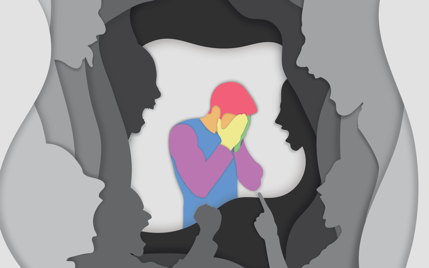
This is how my cutouts started. But after realizing they looked washed out, I added shadows and darkened the shape colors.
My Magazine Design class at the University of North Carolina opened with a challenge: Create a cover for a popular magazine that tackles a serious issue—and do so in a design style you’ve never used before. When I initially thought about doing a piece on LGBTQ+ mental health, I was nervous. As someone who’s struggled with depression and anxiety throughout my life and who’s lost a close friend to suicide, the topic was incredibly personal. But I was also roused to confront the issue, especially when I stumbled upon a new illustration style.
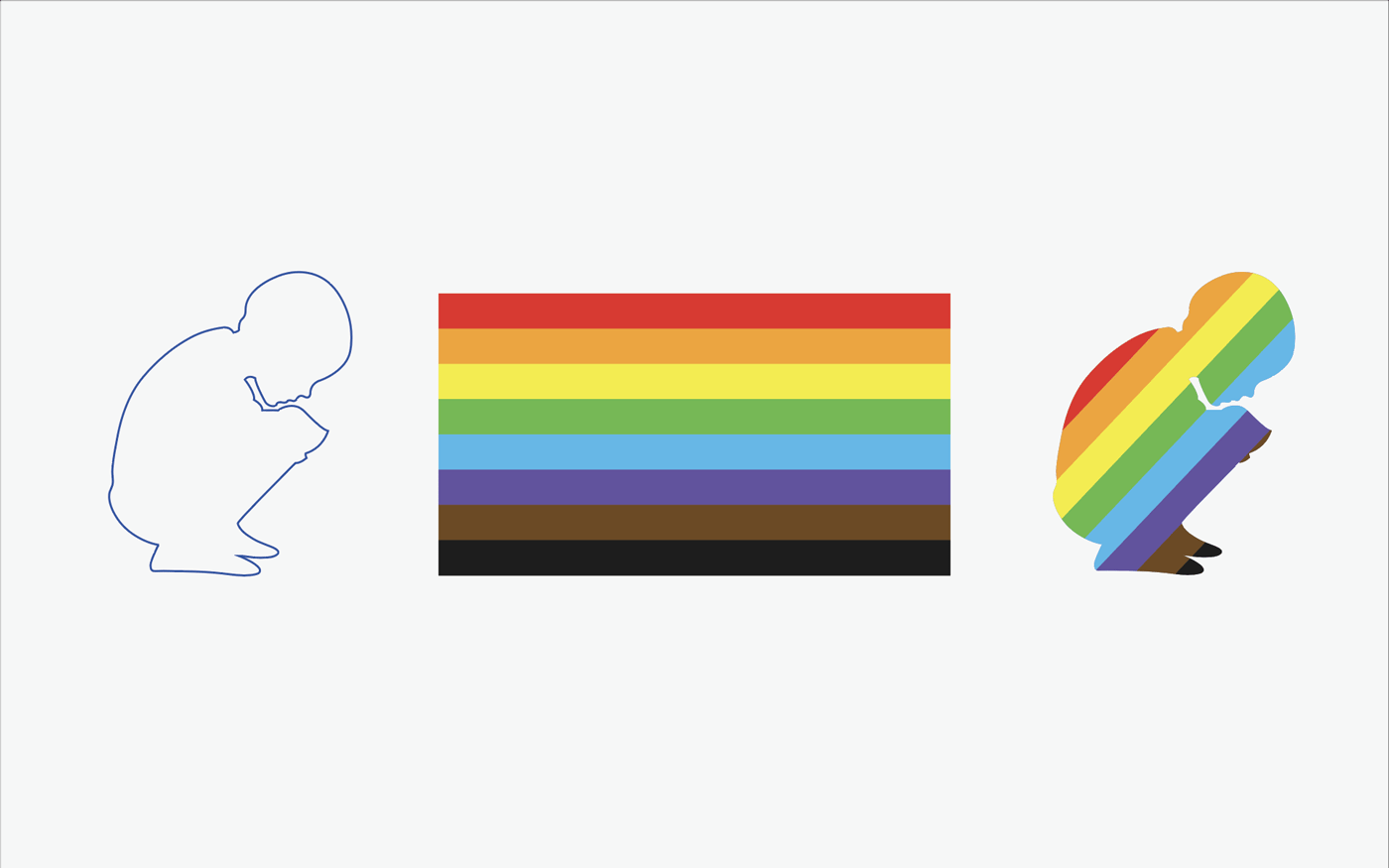
Initially, when drafting ideas for the figure in the middle, I considered using a crouching child—but I decided against it, in part because I thought having the stripes overlay the body didn't fit well with the cutout style.
I based this cover on paper cutout art that I’ve seen across the internet for years but never had reason to emulate. For this project, though, it seemed perfect. The style of these cutouts is inherently claustrophobic—they create the sensation of walls closing in.
The style was easier to achieve than I expected. After creating shapes for the outer border in Adobe Illustrator, I simply duplicated them, repositioned them, changed their color to black, and added a gaussian blur to create a shadow effect. I then added faces to the borders (with their own shadows) and drew the figure of the man in the middle.
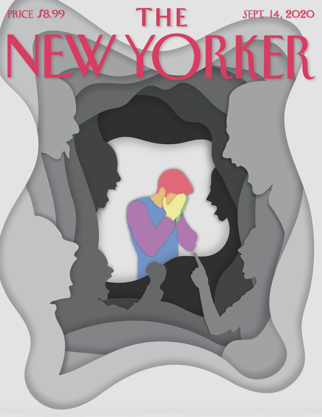
The color choices in this piece were deliberate. Gray represents the anxiety and depression that many LGBTQ+ people deal with. The rainbow colors signify both that the man is queer and that he has life beneath the layers of gray.
Technically, this piece was not particularly difficult to create. Emotionally, however, it was. I identify with the man standing at the middle of the page, and I’ve heard the voices that threaten to overwhelm him. Whether internal or external, those voices make it difficult to imagine a better future—and I hope one day queer kids won’t have to listen to them.